The Minnesota Twins released new jerseys this past week, introducing a different aesthetic to their main uniforms, and an alternative version featuring inspiration from the Twin Cities, the namesake of the team. Here are a few thoughts.
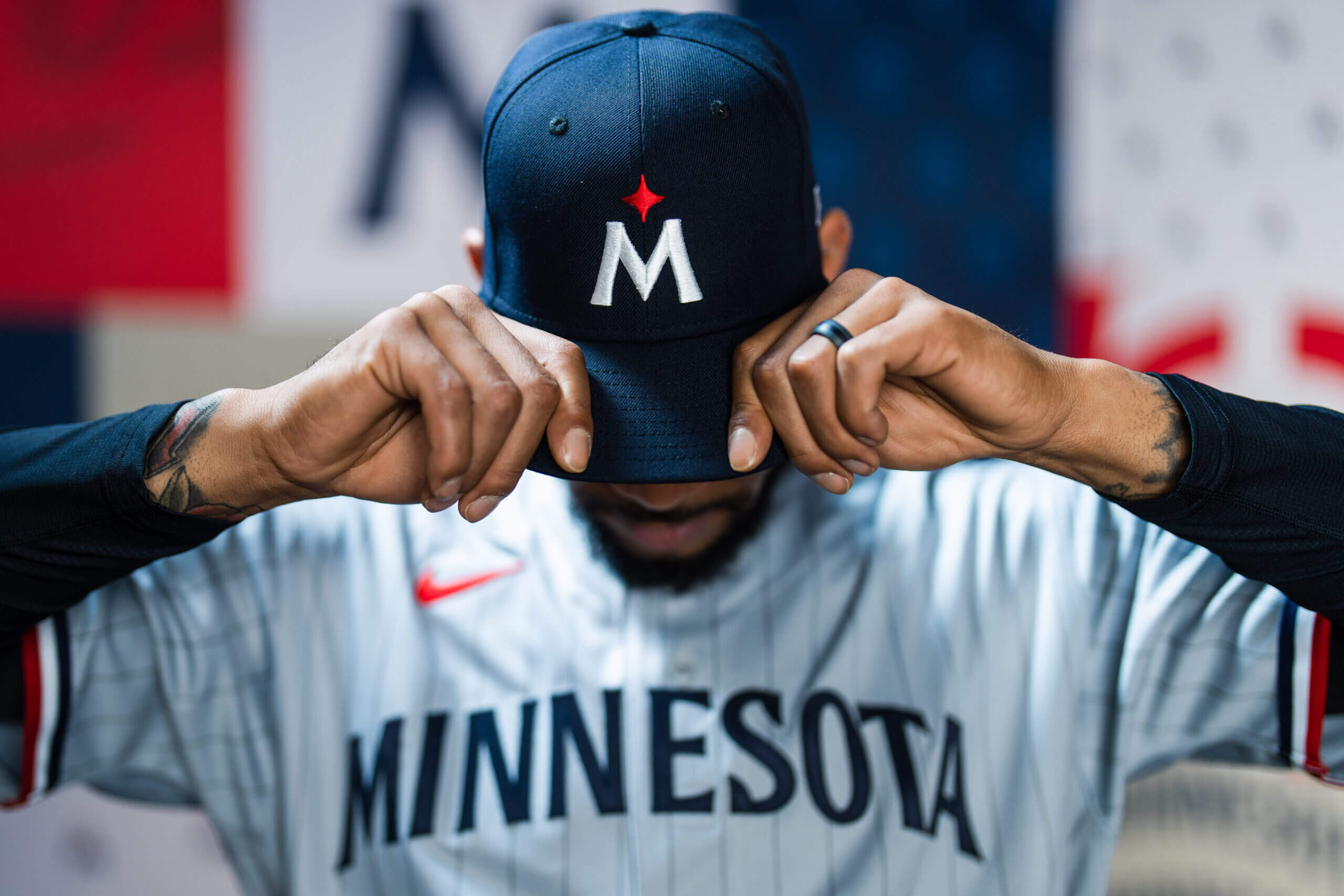
The most egregious issue with the new design is the similarity of their new “M” hats to those of the Miami Marlins from around 2017. While it’s not a direct copy, the very boring “M” on the Twins’ hat is not engaging.

Marlins Old Hat

Twins New Hat
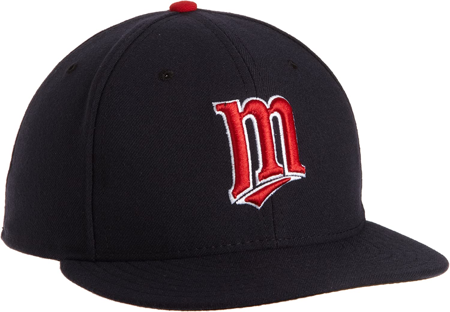
Compare this to the older version of the “M” hat from a couple decades ago, and the change is a pretty odd choice.

At best you could argue they’re going for some North Star vibe, but it’s poorly executed and not in line with the rest of the design.
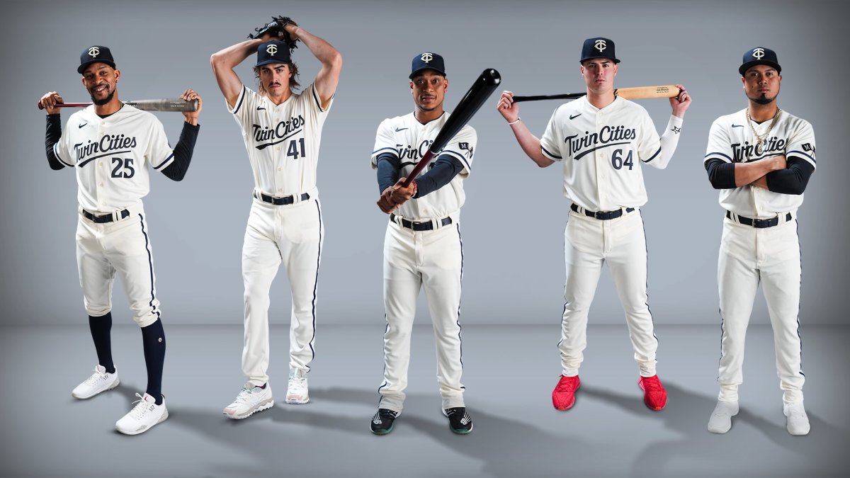
Now, the big reveal was the Twin Cities jersey with an augmented logo.

I think these are alright. I’m sure they’ll grow on me, and hopefully these are similar to other City Connect jerseys rolled out by other teams, where they are only worn for home games on a particular day of the week. Having a muted color pattern is pretty disappointing, particularly when compared to the baby blues from the ’70s and ’80s. Not differentiating the colors in the “T” and the “C” is also a losing move.
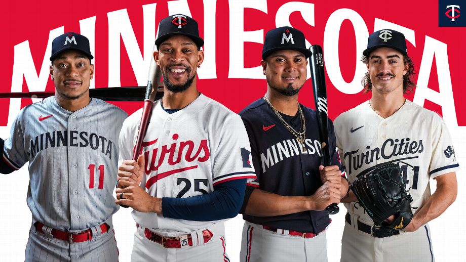
However, the three other main jerseys (ignoring the hats) are excellent.

I think they’re a fun change, and getting pinstripes back is awesome. These are jersey designs I would love to have, but I’ll stick with my current hats.